Pickles makes a come back. unfortunately this time he is not well. My analytics chart is for an app that monitors your pet’s symptoms. This is timely for me given my own moggy has just had pancreatitis!


Pickles makes a come back. unfortunately this time he is not well. My analytics chart is for an app that monitors your pet’s symptoms. This is timely for me given my own moggy has just had pancreatitis!
It’s so easy to shop online today. It’s great if you live out of town and just don’t have specialty shops near you. Or if like me you live in NZ, somethings you just can’t get in the shops here, so have to import them. One of the important steps in any transaction is the receipt – The thing that proves you’ve paid for your goods. Here is my version of an email receipt.


Padlock con made by Freepik from www.flaticon.com is licensed by CC 3.0 BY
I have been off on holiday and then off with sickness, but am back on deck.. well just about. Hence this lame introduction to challenge number 15 – on/off switches. Here tis.

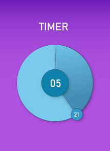
“It’s the final countdown.. do do doo dooo” Now we all have that Europe ear worm stuck in our heads, here is my attempt at Daily UI challenge number 14.
Its hard to fully appreciate a dynamic timer in a static image. The concept though is the centre number is minutes and the seconds is in the little circle, which moves around the outer circle clockwise (like a second hand), darkening the largest space behind it as it goes. Every time it gets to the top. the minute ticks over and the outer circle resets to light blue.
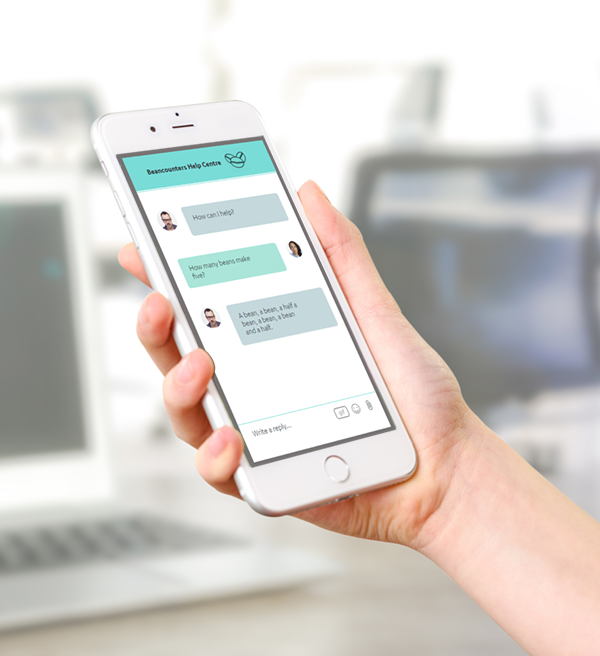
Horatio Snodgrass comes to the rescue in this direct messaging app to answer the age old question of how many beans make five?

Trying to make up time here. Cheating really, as I have not had time to design something from scratch.This is a screenshot of a website I used to have. It was a free WordPress template that I then modified with custom CSS. So although technically not entirely my design given the base layout was provided. I did overwrite certain elements to make them look how I wanted.

Number 11, but not day 11. Been a bit behind on getting these done. Life gets in the way, but still it’s finished.

The interwebs has allowed us to share like never before. Photos of the most magnificent scenery down to the insignificant…what we had for lunch.
The share function has become integral to websites and social media platforms. Facebook your tweet, Pin your Insta – Anyway you can, spread your content widely and share it with the world, whether it wants it or not…
Here is my design for a share button with some popular channels for images.

I said I struggled with the last challenge. I have been looking at what I designed and I can definitely see some problems with it.
The major issue I think is that the album/song images are displayed on a carousel type thing – were the user can swipe to move to the next song. That in itself is not a problem, But I have put clickable elements on it such as the search and menu. so if the user try to tap one of these they may accidentally move the carousel. Big usability fail!!

To solve this I have moved the menu and associated control above the carousel. This was a minor rejig but would make the usability much better.
I changed the colours a bit too, not for usability, just cos I felt like it.

