I really struggled with this one and am still not particularly happy with the final result. I think I found it intimidating to come up with something new when the big guys (Samsung, Apple have already produced such successful interfaces for their music players.
Does anyone else collect recipes that they never make? At least now being digital they don’t take up any room. No more scrappy photocopies stuffed into folders or pages torn from a magazine. Now you can just bookmark a page, save a link, take a screenshot, or even take a photo of that magazine page.
My design for the Settings challenge was a simple subscription settings page for a recipes website.
My interpretation of this challenge is a profile such as you would find in a staff directory.
Also I have nothing against bean counters some of my best friends are bean counters :0)
My parents live in a retirement village and my dad is in a band there called the Rheumatics. :0) One of his fellow guitarists only plays 5 chords and refuses to learn any more so dad has to transpose their music into a key she can play! My dad being the techy sort decided to write his own bit of software to do this. “But wait”, I hear you say. “There are already plenty of apps out there for your phone which do this”. True, but he wanted one on his laptop as the phone screen is too small. Why am I telling you this? because I needed and introduction and it is the inspiration for this days app icon challenge – a music transposition app icon
Took the easy way out on this one due to time and (brain fade) and drew up a standard calculator. would quite like to revisit this challenge later and do something else like a mortgage calculator. maybe something with sliders or some other more interesting interface. Still here tis.
I think somehow in my last UI attempt “The landing page” I managed to implement the Z design pattern without even trying (yay me). The Z pattern is basically a layout that makes use of how people scan screens (in the western cultures) left to right, top to bottom. Important elements are located at the end points and elbows of the Z. A full explanation of the Z pattern can be found on creativebloq.
The logo (very important) is located top left – identifies the site owner. The eye tracks right across the main nav. The end of the main nav is often where the search is located. It then goes down via the main image to the bottom left button to the bottom right. The last button on the bottom right could be a call to action such as ‘Buy now!!’…not sure people actually buy new cars online, having only had second hand myself, so I thought reading some good reviews might be persuasive instead, but you get the idea.
This is a little bit more familiar to me as I work with websites, though not in an advertising space. I have been drooling over the latest Mazda CX3 recently after I saw one in the train carpark the other week. Somehow my 2005 Mazda Demio now looks a little sad in comparison. Still as it says in Exodus, ‘ Do not covert thy neighbour’s donkey’ (or CX3 perhaps?). So I wiped aside my drool, made this page and I shall never think of it again!..fortunately they seem quite rare around here, so I don’t have to see them very often. 🙂
I have bought plenty of things online, but I still can’t remember my credit card number. probably just as well! Also, for the life of me, I could not remember (beyond having to fill in the number and expiry date) what a credit card checkout form has on it. I see these things all the time, but don’t really pay attention to them. Which is actually not a bad thing from a users perspective. If its doing a good job I shouldn’t have to pay too much attention or think about it – I just want to buy that thing I don’t really need.
If it’s bad that’s when we notice it… cos we want to hurl our (insert appropriate device) across the room and scream in frustration.
Now I am learning about UI and UX though I am paying more attention and trying to see what makes a form good or bad. It’s a huge area which I will delve into more later.
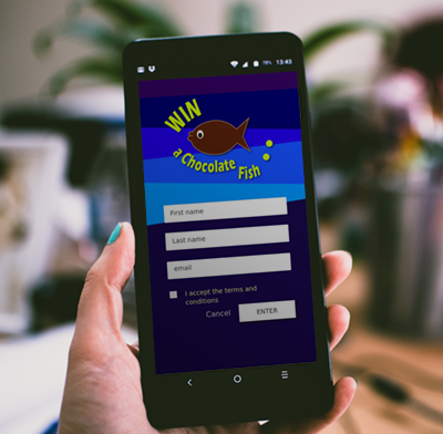
Day one. Design some sort of sign up or entry form thingy. Mind blank! . OK just make something, anything!. Chocolate fish – the ultimate Kiwi award for doing good work. Win a chocolate fish.. why not? That’ll do.
WIRE FRAME
Well that was ok. The wire frame is fine. The final design is somewhat uggo, but the only way is up.. I hope.